What folks really mean when claiming they “don’t get art” is usually just uncertainty about where to focus their eyes.
Artists everywhere use similar tools - no matter when they lived or what materials they choose. People call these tools the elements of art. Studying them won’t make creating feel like math. Instead, it helps you pay attention, talk about, and grasp how visuals work. Yet each piece still feels unique.
Funny thing is, you can skip the dictionary stuff. Notice instead how each detail appears here and there. One moment it shapes color, next it shifts mood. See that? That’s enough.
Every part of art gets broken down here using words anyone can understand. Picture things you’ve actually seen, like posts online or paintings on a wall. Examples come from places you already know. You might spot them in a gallery or while scrolling your phone. Each idea connects to stuff out there in the world. Nothing feels distant or fake. It sticks close to what’s around you.
The Toolkit
Art begins with pieces you can see. These parts help makers build images that speak without words. Imagine each one as a tool in a kit. One choice leads to calm feelings, another sparks energy. Mix them wrong or right - outcomes shift every time.
Shape meets line, color dances with texture. Space holds form while value guides perception. Rhythm ties movement to structure. Balance shifts through contrast. Each part speaks when placed together:
Line
Shape
Form
Color
Value
Texture
Space
Painted marks might seem wild, yet they’re chosen on purpose by the artist. Though a piece feels free, each shape follows a deliberate thought. Even chaos gets shaped with care behind the scenes. What appears unplanned often hides careful decisions underneath. Every stroke answers an unseen plan, not just impulse.
1. Line

Photo by nurs raw on Pexels.com
A mark that travels makes a line. That simple start builds all visual work. Most fundamental piece, it shows up before anything else appears.
A line might take a bend, then again it could stay straight. Curved paths differ from rigid ones in how they move across space:
Thick or thin
Continuous or broken
Smooth or jagged
What Line Does
Lines can:
Define shapes and forms
Create movement or direction
Express emotion
Take how Leonardo da Vinci drew things - his sketches relied on soft, steady strokes to explore bodies and movement.
Waves of motion twist through Van Gogh’s work, pushing each scene into restless life. His strokes pulse with energy, pulling the eye across fields and skies. Movement hums beneath every line, like wind caught mid-breath. Paint seems to vibrate on canvas, never still, always shifting. Each mark adds tension, building a quiet storm behind color and form.
A single stroke can carry the whole image, leaving out shadows, ignoring hues. Lines do everything when nothing else shows up.
What to Ask When Looking: Start by checking if the lines feel relaxed or forceful.
Does their shape bring ease or tension?
Look closely - do they push forward or stay back?
Can you sense a quiet mood or something sharp?
Are they soft on the eyes or do they grab attention too fast?
Is there a path my gaze follows because of them?
Are they restricted, yet somehow still able to show themselves? What shape does that tension take?
2. Shape
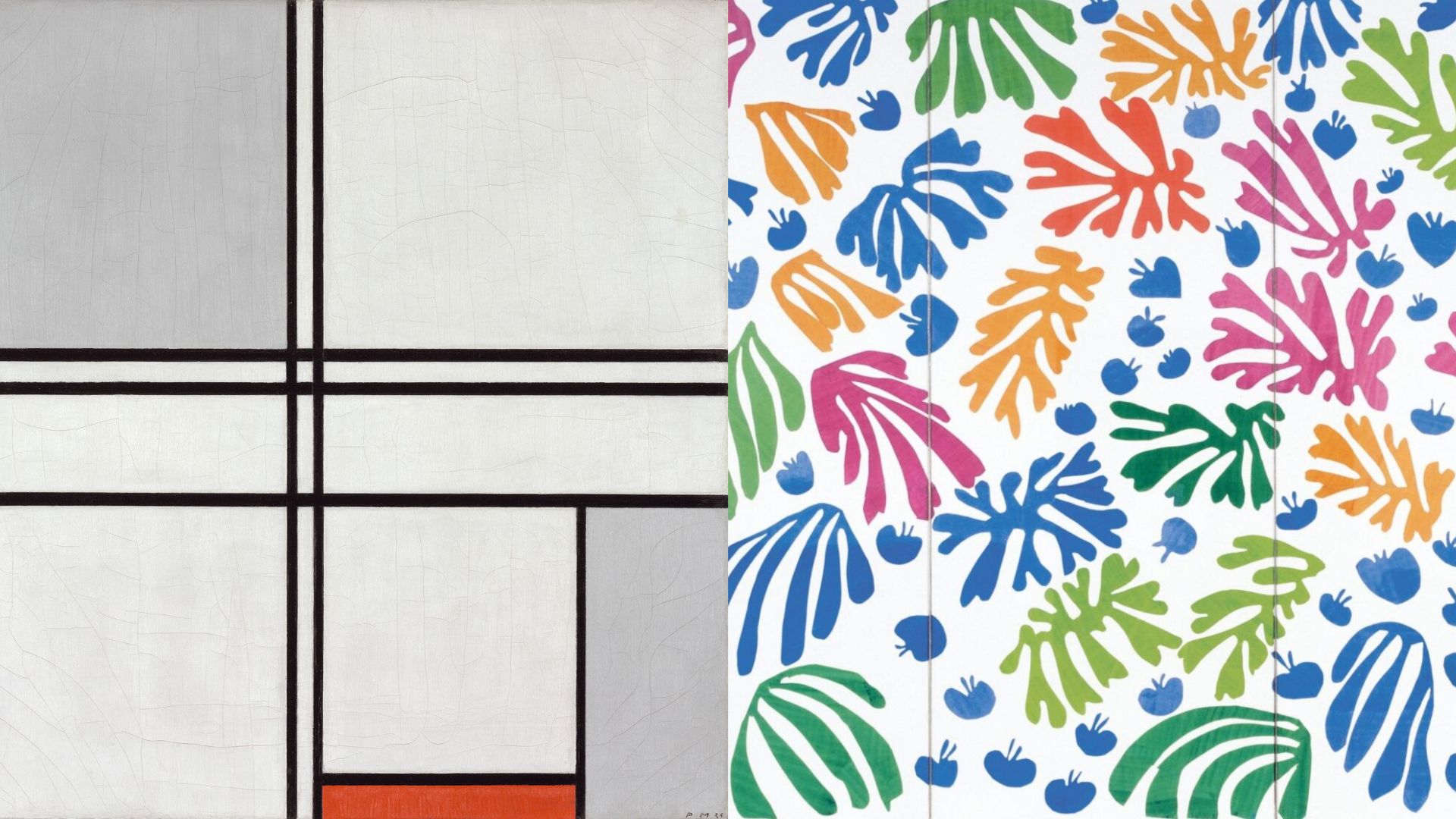
A side-by-side comparison. Left: A Piet Mondrian painting (Geometric). Right: A Henri Matisse cut-out (Organic)
A shape appears once a line loops around space. Flatness defines it - no depth at all. Its presence lives on paper, screen, or wall, always thin.
One kind comes first. Another sort shows up next:
Geometric: Circles roll where corners sleep. Where lines meet sharp, triangles form instead. Squares hold steady with edges even and wide apart.
Organic shapes: Irregular, natural forms (like leaves, clouds, bodies).
What Shape Does
Shapes help:
Organize a composition
Choose form instead of disorder
Start with shapes that carry quiet meaning - circles might suggest flow, maybe endlessness. A triangle could bring a sense of push, of movement forward. Some forms rest easily, others stir something sharper. Round edges may cradle attention gently. Pointed ones pull it sharply elsewhere. Meaning builds without words, just structure. Each shape holds its own kind of weight.
Piet Mondrian used clear rectangles, nothing curved. His work feels calm because lines meet at right angles. Shapes stay separate, never blend into one another. Straight edges define each color block precisely. The arrangement looks planned, not random. Horizontal meets vertical without overlap. Color fields sit still, do not flow. Structure comes from how pieces align. Space between matters just as much as what fills it.
Henri Matisse’s cut-outs use bold, organic shapes to create movement and joy.
Shape holds things together when nothing looks familiar. What you see might not be a tree or a face, yet forms take charge. Lines bend into something that feels like meaning without showing it. Even invisible ideas lean on how things are built. Structure stays important, even when reality fades away.
What to Ask When Looking: Look closely.
Do the forms stand out clearly, or do they blur into abstraction?
Could you name them easily, yet something feels off?
Maybe edges twist away from meaning.
Perhaps familiarity hides in fragments.
Each shape might suggest a thing, then refuse to confirm it.
Is recognition possible, still just out of reach?
Are things holding together - or falling apart?
Do the forms repeat themselves, yet sometimes shift slightly? What stays consistent might also change without warning.
3. Form

Photo by Brian Banford on Pexels.com
A round ball has form because it feels solid, like you could hold it. When a drawing looks bumpy or thick even though it's on paper, that flat thing pretends to have depth. Things we can touch from more than one side usually show what form means.
Form can be:
Actual: Sculpture, installation.
Implied: Paintings or drawings that suggest depth through shading and perspective.
What Form Does
Form helps create:
Realism
Physical presence
Heavy shapes fill space. What matters sits there, real. Fullness shows in how it rests. Size makes itself known without noise. Presence comes through solid form.
Real Examples:
Michelangelo’s sculptures emphasize the human form with dramatic realism. Figures gain a sense of volume through contrasts of brightness and darkness in Renaissance art.
A shape might appear shattered, viewed from several angles all in one go. Pieces line up sideways, tilted, stacked without order.
What to Ask When Looking:
Does this artwork feel flat or dimensional?
How does the artist suggest depth?
What matters more - truth or illusion?
4. Color
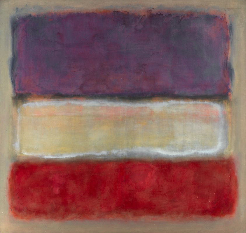
A Mark Rothko painting featuring large blocks of color
A splash here, a hue there - color hits feelings deep. It shapes how we experience every artwork. Strong reactions often come from shades alone.
Key aspects of color include:
Hue (the color itself)
Saturation (intensity or dullness)
Temperature (warm vs. cool)
What Color Does
Color can:
Set mood and atmosphere
Build balance - or disrupt it
Direct attention
Floating areas of hue in Mark Rothko’s works stir deep feeling. These broad patches of paint do more than fill space - they pull viewers into quiet reflection. One shade layered over another builds tension without words. Mood shifts happen slowly across vast surfaces. A single canvas can hold stillness and storm at once.
Light dances across Impressionist canvases through vivid, fragmented hues. Sometimes a brushstroke flickers like sunlight on water. Color splits into tiny patches, each one trembling with energy. You see motion not by lines but by how tones collide. Brightness emerges from chaos, not careful blending. These artists trusted the eye to mix what the hand left apart.
One hue sets a quiet mood. A narrow range ties things together through repetition. Tone grows tighter when choices stay small. Restrained shades speak without shouting. Fewer colors act like silence between words.
What to Ask When Looking:
Which colors dominate?
Do the hues look true to life, yet somewhere else entirely?
What emotion do the colors bring out in me?
5. Value
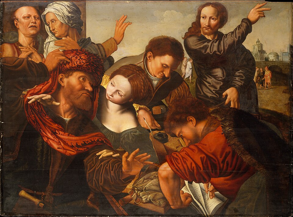
A Caravaggio painting (The Calling of St Matthew)
A shade might seem faint, yet it still holds a place on the scale of brightness. Darker tones take up one end, lighter ones stretch to the opposite edge. Shades hold power beyond hues - think of how grayscale images shape what we see. A photo stripped of color still tells depth through contrast alone.
What Value Does
Value helps:
Create contrast
Suggest light sources
Shape rises when space fills the outline. Depth appears once layers stack beyond flatness.
Take Caravaggio's work. His art leans on sharp light-dark splits. These shifts stir tension. Look closely - brightness cuts through shadow like a blade. Emotion rises where contrasts clash. Drama lives in those edges.
Pencil on paper finds shape through quiet changes in darkness. A single bright spot can pull attention through a dark frame. Shadows stretch where light cuts across, shaping what we notice first. One area stands out because it’s much lighter than the rest. The difference between tones tells your gaze where to land. Without that shift, everything blends into gray.
What to Ask When Looking:
Where are the lightest and darkest areas?
Does the contrast stand out sharply, or is it barely noticeable?
How does light shape the scene?
6. Texture
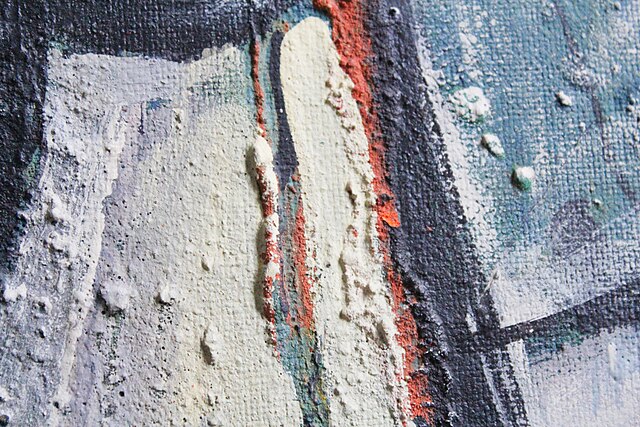
A close-up macro shot of an oil painting showing the ridges of the paint (Impasto)
Smooth, rough, bumpy - texture is what you expect when touching something. How things appear can hint at their touchable qualities.
One kind comes first. Another shows up later:
Actual texture: Physical surface (thick paint, rough stone).
Visual texture: What you see might feel real, even if it isn’t. Paint can seem smooth without being touched. Coldness comes through shiny surfaces, though they’re warm. A look holds a sensation. Eyes borrow touch. Surface tricks mind into feeling.
What Texture Does
Texture can:
Add realism
Create visual interest
Evoke sensory responses
Real Examples:
Impasto painting techniques create thick, visible brushstrokes.
Photorealistic drawings carefully imitate textures like skin or fabric.
From paper scraps to fabric bits, glue holds them together in layered art. Texture comes alive when everyday things meet paint and paste.
What to Ask When Looking: Check how the material feels by eye. Is it even or bumpy? Look closely before deciding.
What if I tried to picture that sensation? Maybe a quiet moment could show me.
Does the surface stand out, or does it stay quiet?
7. Space
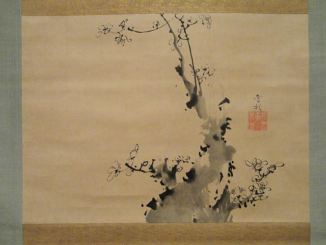
A traditional Japanese ink wash painting with lots of empty white space showing "Positive" vs "Negative" space.
How things sit on a page shows space. Depth comes through placement. Arrangement gives meaning beyond just position.
Here's what stands out. The central figure takes up room. What you see first matters most. Focus lands on that part. It grabs attention simply by being there.
Negative space: The area around it.
Up front, things appear larger. Moving back, objects get smaller but stay visible. Farthest away, shapes blur into distance.
What Space Does
Room to breathe makes it easier to pay attention
Suggest scale
Control balance and breathing room
Take actual cases. Blank spots fill much of a Japanese ink painting on purpose.
Renaissance perspective creates the illusion of deep space.
Out here, empty areas make you pause. A quiet moment stretches when less fills the scene. Space pulls attention without shouting. Slowness arrives where clutter stops.
What to Ask When Looking:
Is the composition crowded or open?
Where does emptiness guide your eye toward the main figure?
Could it be on purpose that nothing fills the space?
Bringing it all together
Every piece of art holds more than a single part. These pieces keep touching, shifting how they fit.
A good place to start?
Think about how lines meet edges.
Shape steps in when boundaries appear.
Form takes hold once those shapes stack up.
Color and value create mood.
Texture and space affect realism.
What stands out in a piece often matters as much as what's hidden. Spotting those decisions reveals purpose, especially when the work seems strange at first.
Art makes sense without breaking it down. Seeing shapes, colors, or lines doesn’t have to feel like a test. It is enough to notice just a single part first. Notice the color. Or the lines. Maybe how we fill empty areas matters just as much.
Your eyes get better at spotting things as days go by. Felt truth grows richer when understanding steps in.
Your New Perspective
Here is how it feels when you start to notice shapes, lines, colors - not just look, but really see. These tools help you describe what's in front of you without needing answers or fearing mistakes. A drawing isn’t about truth - it’s about observation. Words like form, texture, space become part of your eyes. You begin to break down images almost like hearing each note in a song. It changes how you watch the world. Noticing becomes its own kind of understanding.
Take a breath. That pause matters more than speed ever could.
Notice intention
Build confidence
Art matters more when you notice different kinds
Funny how clarity shifts things - suddenly, it's not magic, just pieces fitting. What seemed confusing now pulls you in, different than expected.